Aspire Design and Home: Dec 2022
A West Village Townhouse Gets A Sophisticated, Light-Infused Update
For a family of six, returning home meant a move from their uptown duplex to the West Village, where they lived when they were first married. To achieve exactly what they were looking for, they hired Kevin Lichten of Lichten Architects to update the narrow-yet-tall home. Alicia Murphy came on board to complete the interiors of their new space. The five-story historic townhouse needed an infusion of light and an overall update. Lichten explains, “They always longed to return to downtown. A townhouse and rear garden carriage house in the West Village were perfect to allow them to return to their old neighborhood and accommodate their lifestyle of family and very casual entertainment.”
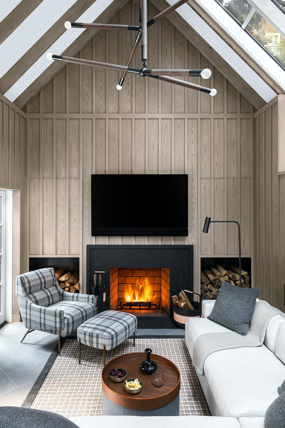
Murphy shares that the family loves to entertain. “They wanted the home to be welcoming and casual but still have a level of formality to it. Given its location and history, our design is a mix of classic New York with a modern, unpretentious twist.” Murphy worked with a muted color palette blended with graphic black-and-white accents. Smart built-ins make the most of the limited space, and a Waterworks kitchen is an elegantly appointed workhorse. In the back, an outdoor kitchen, garden and seating area lead to a “Dad’s den.” The house provides a needed respite from the hustle of New York City life.
The existing house presented a challenge in that it had a small footprint, even though it had five floors. Lichten came up with a solution. “The architectural challenge was to unite what otherwise would be a stack of disjointed floors. We created a visually strong sculptural staircase, which required convincing the clients to devote a large portion of each floor to the spiral stair. The result was worth the sacrifice; at each level you can clearly see the floors below and above, knitting the entire house together.” To create a dramatic focal point, a massive chandelier by Cameron Design House – reminiscent of ascending Champagne bubbles – fills the space.
For Murphy, the color palette was a natural. “In this home, as in many of our projects, I use black and white as neutrals, and I soften the edges with warm textures and sculptural pieces. Black and white are very calming to me and act as a base. They are colors found in nature, making it easy to weave in color and texture to ramp up the drama.”
SOURCES: Photography , Brittany Ambridge | Landscape designer, Robin Key, RKLA | Stylist, Martin Bourne | Contractor, Highline Construction | Front façade lights, Bevolo | Light in stairwell, Cameron Design House | Laylight, custom by Lichten Architects and produced by Gil Studios | Kitchen cabinets, Waterworks | Kitchen light fixture, Roll & Hill | Carriage house lighting, Apparatus | Carpet, Stark | Chair, Atelier Purcell | Sofa, custom AMD | Outdoor sofa and chair, Dedon | String lights, Bover | Dining table, Royal Botania | Dining chairs, Gloster | Planters, Atelier Vierkant | Primary bath, Marble, ABC Stone.


